November 20, 2018, 4:55 am
New features in Wijmo 2018 v3 .Wijmo Core adds Web Workers, new OLAP features, a Ribbon sample, accessibility improvements and more.
Features
Updates in Wijmo Core 2018 v3
- Faster PDF Export with Web Workers
- PDF export can often slow down web apps: since the export is happening in the browser’s UI thread, it can cause the rest of the application to be unusable. This is where Web Workers comes to the rescue. We used Web Workers to process the exporting of PDF files on a separate thread from the application UI. This allows the applications to stay usable and the PDF export to churn along in the “background”.
- Group Headers in ComboBox/ListBox
- We've added a showGroups property that you can use to add group headers to ListBox and ComboBox controls. Group header items are added if the showGroups property is set to true and the itemsSource collection has grouping enabled.
- Ribbon Sample using TabPanel
- We’ve added a ribbon sample that shows how you can create ribbons easily using the TabPanel control and the controls in Wijmo's input module.
- The ribbon element is a TabPanel. The tab pages contain groups of controls arranged in rows and columns. Controls in the groups use Material Icons, and have tooltips created automatically based on the aria-label attribute assigned to each control.
- Slicer for OLAP
- We have added a Slicer control to our OLAP module. The Slicer control provides a quick way to edit filters applied to PivotField objects.
- It provides buttons the user can click to filter data based on values and indicates the current filtering state, which makes it easy to understand what is shown in filtered PivotGrid and PivotChart controls.
- Detail Dialog API in OLAP
- The Wijmo PivotGrid allows you to drill down into cells to see the data items that were used to calculate each summary. Users can invoke the detail dialog by double-clicking any value cell. You can also invoke the detail dialog by calling the grid's showDetail method and passing the coordinates of the cell.
- Now, the grid exposes the detail dialog through its detailDialog property, which can be used to customize the dialog.
- Calculated Fields in OLAP
- We also added a PivotField.getValue property to OLAP that allows you to specify a custom function to be used for retrieving the field value for a given item. You can use this to implement calculated fields such as 'binning' (e.g. Value => large/medium/small) or calculated expressions (e.g Conversion => downloads/sales).
- Year Picker in Calendar
- We added a small but useful feature in our Calendar and InputDate controls. You can now click on the year header to open a year picker that allows you to much more easily jump to different years. This little enhancement should save your end users some time when selecting dates.
- Submenu Support Added to Menu
- We got this request from a customer and thought it was a great idea. Our Menu control now supports adding multiple submenus to it so that you can create more complex menus and context menus. We also added an option to open menus on hover.
- Looking for Angular 7 Support?
- We're very excited about Angular 7, and as you know, Wijmo has first-class Angular support. We're happy to announce that Wijmo supports Angular 7, so you can use the current version of Wijmo to build Angular 7 applications today.
- New Samples
- WebComponentsIntro
- MyBI
- Ribbon Control Example
- Slicer for OLAP
- OLAP Detail Dialog
- Group Headers in ComboBox
- HierarchicalMenu
↧
November 21, 2018, 7:06 am
New Material Theme Designer in C1 Studio for WinForms.New Material Theme Designer, Sparkline control and FlexGrid integration, plus DataFilter control beta release.
Features
- New Material Theme Designer - In addition to adding Material, Material Dark, and Office 2016 Excel Green themes, WinForms now features a Material Theme Designer sample that allows you to set the primary and accent colours of Material theme and save\load them in C1themes format.
- New DataFilter control (beta) - A powerful UI addition, the DataFilter provides an easy, ecommerce-like filter to accompany any data-aware control. You can create filters from datasources, autogenerated, or create them manually. The accordion-based filtering UI can be attached to any control sharing a datasource or plugged into an info screen. The DataFilter is in beta mode and will be launched in 2019 v1.
- New Sparkline control and FlexGrid integration - This lightweight sparkline chart control represents the general shape of data variation in a condensed visual. It's often embedded in grids, and as such, FlexGrid can now display sparklines in columns, and it's now easier to plot trends inside FlexGrid cells. The sparkline property of the FlexGrid column supports plotting line, column, and WinLoss sparklines. You can further customize these sparklines by setting the Axis, markers, and series colours among others.
- FlexGrid now supports SortInfo and GroupInfo, so column information can now be saved and loaded.
- Scheduler's table and agenda views are now launched and out of beta.
- FlexChart now supports animation when loading, updating, and adding new data.
↧
↧
November 21, 2018, 7:06 am
Simplified Ribbon Control in C1 Studio for WPF.Adds Simplified Ribbon contol, new FlexGrid101 Samples, customized icons, plus updates to Scheduler.
Features
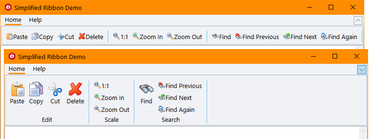
- Simplified WPF Ribbon - Improve the look and navigation of your WPF apps with the modern, minimalistic simplified ribbon. This new control occupies the middle ground between a ribbon a toolbar, providing a single-line collapsed state, or a three-line ribbon-like appearance, and its design is influenced by Microsoft's ever-evolving Office 365 ribbon. You can customize the style of the ribbon, as well as the buttons you'd like to include.
- FlexGrid101 Samples - Added a new C1Icon that enables a new level of customization for the sort, filter, and grouping glyphs, as well as FlexGrid101 samples to make it even easier to get started with this popular control. They demonstrate features like selection, cell customization, conditional formatting, filtering, the RowDetails feature, cell merging, and many other points of interest.
- C1Icon - A new object that is used within the FlexGrid to make it much easier to customize the many icons used throughout for sorting, filter, etc. C1Icon allows you to specify your own image, font character, or use a built-in template to change the appearance of the icons found in the data grid.
- Scheduler Updates:
- New TableView Scheduler sample displays appointments in a table view that can be grouped, sorted, or filtered as specified by the developer or end user. It's similar to the Outlook 2016 List and Active views:
- AgendaView displays appointments grouped by date in a table view where a single table row represents a single appointment. Users can edit appointments by double-clicking on an appointment and opening the EditAppointment dialog. This view is always sorted by dates in ascending order, and doesn't have row or column headers.
- New "Working Elsewhere" appointment availability status has been added.
- FlexChart Updates:
- Animations - FlexChart and Finanical Chart now has animations for loading, updating, and changes to the chart axes. You can also create your own custom animations using the AnimationTransform event.
- Scale Breaks - FlexChart has also been updated to support axis scale breaks. Scale breaks can make irregular data that varies by a large magnitude easier to read as it makes the lower end of the scale more visible.
- Ranged drawing mode - allows support for built-in floating bar and Gantt charts. Ranged drawing mode is available for Bar, Column, and Area Charts.
- UWP controls are now available through NuGet.
↧
November 21, 2018, 7:06 am
New Flight Statistics sample in C1 Studio ASP.NET MVC.Adds new Flight Statistics sample, Group Items in ComboBox and ActiveReports support to FlexViewer.
Features
- New Control Designer for ASP.NET MVC - With the newly-enhanced scaffolders, you can use the control wizard to configure controls when you're not using Entity Framework and generate code for a C1 MVC control. In addition to inserting a new control, this now supports updating an existing control definition using the wizard. This wizard can be invoked through the context menu or through Quick Actions in Razor view. This feature is supported in ASP.NET MVC and ASP.NET Core MVC.
- New Flight Statistics Sample - This dashboard-style sample displays flight performance data over time. Controls include FlexGrid with sparkline columns for delay trend and KPI columns. A treemap, bar chart, and line symbol chart are used in to display region-wide statistics, and users can drill down to a specific region and city by selecting the data points. On clicking a region in the Total Flights TreeMap, the FlexGrid displays the details of that region.
- Group items in ComboBox - From the user request folder! With CollectionView already supporting grouping, ComboBox grouping could be implemented with some custom code, but we added this as a simple property in the control itself:
- ActiveReports added to FlexViewer - In addition to FlexViewer's support for ActiveReports, a new Item Template allows you to quickly configure the viewer in your ASP.NET MVC app.
- DashboardDemo updated with Material Design - The DashboardDemo has been updated to include Material Design principles and color schemes. In addition, the DashboardLayout control has been added to the dashboard and analysis tabs.
- FlexGrid Enhancements:
- Use ColumnGroupProvider to create multi-level merged-cell column headers for groups of related columns.
- FlexGrid AccessibilityExtender can be used to easily extend accessibility support in one of two ways; Resize columns using the keyboard (alt+left/right keys). Provide an "alert" method that changes the content of an invisible element with the role "alert." This allows assistive tools to announce grid actions like sorting and filtering.
↧
November 21, 2018, 7:06 am
ComponentOne Studio UWP FlexChartsNew animations for FlexChart and Financial Chart, plus ranged drawing mode for Bar, Column and Area Charts.
Features
- Simplified WPF Ribbon - Improve the look and navigation of your WPF apps with the modern, minimalistic simplified ribbon. This new control occupies the middle ground between a ribbon a toolbar, providing a single-line collapsed state, or a three-line ribbon-like appearance, and its design is influenced by Microsoft's ever-evolving Office 365 ribbon. You can customize the style of the ribbon, as well as the buttons you'd like to include.
- FlexGrid101 Samples - Added a new C1Icon that enables a new level of customization for the sort, filter, and grouping glyphs, as well as FlexGrid101 samples to make it even easier to get started with this popular control. They demonstrate features like selection, cell customization, conditional formatting, filtering, the RowDetails feature, cell merging, and many other points of interest.
- C1Icon - A new object that is used within the FlexGrid to make it much easier to customize the many icons used throughout for sorting, filter, etc. C1Icon allows you to specify your own image, font character, or use a built-in template to change the appearance of the icons found in the data grid.
- Scheduler Updates:
- New TableView Scheduler sample displays appointments in a table view that can be grouped, sorted, or filtered as specified by the developer or end user. It's similar to the Outlook 2016 List and Active views:
- AgendaView displays appointments grouped by date in a table view where a single table row represents a single appointment. Users can edit appointments by double-clicking on an appointment and opening the EditAppointment dialog. This view is always sorted by dates in ascending order, and doesn't have row or column headers.
- New "Working Elsewhere" appointment availability status has been added.
- FlexChart Updates:
- Animations - FlexChart and Finanical Chart now has animations for loading, updating, and changes to the chart axes. You can also create your own custom animations using the AnimationTransform event.
- Scale Breaks - FlexChart has also been updated to support axis scale breaks. Scale breaks can make irregular data that varies by a large magnitude easier to read as it makes the lower end of the scale more visible.
- Ranged drawing mode - allows support for built-in floating bar and Gantt charts. Ranged drawing mode is available for Bar, Column, and Area Charts.
- UWP controls are now available through NuGet.
↧
↧
November 21, 2018, 7:07 am
Material Theme Designer and ASP.NET MVC Control Wizard.New WinForms Material Theme Designer, Simplified Ribbon contol for WPF and Control Wizard for ASP.NET MVC.
Features
Updates in WinForms
- New Material Theme Designer - In addition to adding Material, Material Dark, and Office 2016 Excel Green themes, WinForms now features a Material Theme Designer sample that allows you to set the primary and accent colours of Material theme and save\load them in C1themes format.
- New DataFilter control (beta) - A powerful UI addition, the DataFilter provides an easy, ecommerce-like filter to accompany any data-aware control. You can create filters from datasources, autogenerated, or create them manually. The accordion-based filtering UI can be attached to any control sharing a datasource or plugged into an info screen. The DataFilter is in beta mode and will be launched in 2019 v1.
- New Sparkline control and FlexGrid integration - This lightweight sparkline chart control represents the general shape of data variation in a condensed visual. It's often embedded in grids, and as such, FlexGrid can now display sparklines in columns, and it's now easier to plot trends inside FlexGrid cells. The sparkline property of the FlexGrid column supports plotting line, column, and WinLoss sparklines. You can further customize these sparklines by setting the Axis, markers, and series colours among others.
- FlexGrid now supports SortInfo and GroupInfo, so column information can now be saved and loaded.
- Scheduler's table and agenda views are now launched and out of beta.
- FlexChart now supports animation when loading, updating, and adding new data.
Updates in WPF and UWP
- Simplified WPF Ribbon - Improve the look and navigation of your WPF apps with the modern, minimalistic simplified ribbon. This new control occupies the middle ground between a ribbon a toolbar, providing a single-line collapsed state, or a three-line ribbon-like appearance, and its design is influenced by Microsoft's ever-evolving Office 365 ribbon. You can customize the style of the ribbon, as well as the buttons you'd like to include.
- FlexGrid101 Samples - Added a new C1Icon that enables a new level of customization for the sort, filter, and grouping glyphs, as well as FlexGrid101 samples to make it even easier to get started with this popular control. They demonstrate features like selection, cell customization, conditional formatting, filtering, the RowDetails feature, cell merging, and many other points of interest.
- C1Icon - A new object that is used within the FlexGrid to make it much easier to customize the many icons used throughout for sorting, filter, etc. C1Icon allows you to specify your own image, font character, or use a built-in template to change the appearance of the icons found in the data grid.
- Scheduler Updates:
- New TableView Scheduler sample displays appointments in a table view that can be grouped, sorted, or filtered as specified by the developer or end user. It's similar to the Outlook 2016 List and Active views:
- AgendaView displays appointments grouped by date in a table view where a single table row represents a single appointment. Users can edit appointments by double-clicking on an appointment and opening the EditAppointment dialog. This view is always sorted by dates in ascending order, and doesn't have row or column headers.
- New "Working Elsewhere" appointment availability status has been added.
- FlexChart Updates:
- Animations - FlexChart and Finanical Chart now has animations for loading, updating, and changes to the chart axes. You can also create your own custom animations using the AnimationTransform event.
- Scale Breaks - FlexChart has also been updated to support axis scale breaks. Scale breaks can make irregular data that varies by a large magnitude easier to read as it makes the lower end of the scale more visible.
- Ranged drawing mode - allows support for built-in floating bar and Gantt charts. Ranged drawing mode is available for Bar, Column, and Area Charts.
- UWP controls are now available through NuGet.
Updates in ASP.NET MVC
- New Control Designer for ASP.NET MVC - With the newly-enhanced scaffolders, you can use the control wizard to configure controls when you're not using Entity Framework and generate code for a C1 MVC control. In addition to inserting a new control, this now supports updating an existing control definition using the wizard. This wizard can be invoked through the context menu or through Quick Actions in Razor view. This feature is supported in ASP.NET MVC and ASP.NET Core MVC.
- New Flight Statistics Sample - This dashboard-style sample displays flight performance data over time. Controls include FlexGrid with sparkline columns for delay trend and KPI columns. A treemap, bar chart, and line symbol chart are used in to display region-wide statistics, and users can drill down to a specific region and city by selecting the data points. On clicking a region in the Total Flights TreeMap, the FlexGrid displays the details of that region.
- Group items in ComboBox - From the user request folder! With CollectionView already supporting grouping, ComboBox grouping could be implemented with some custom code, but we added this as a simple property in the control itself:
- ActiveReports added to FlexViewer - In addition to FlexViewer's support for ActiveReports, a new Item Template allows you to quickly configure the viewer in your ASP.NET MVC app.
- DashboardDemo updated with Material Design - The DashboardDemo has been updated to include Material Design principles and color schemes. In addition, the DashboardLayout control has been added to the dashboard and analysis tabs.
- FlexGrid Enhancements:
- Use ColumnGroupProvider to create multi-level merged-cell column headers for groups of related columns.
- FlexGrid AccessibilityExtender can be used to easily extend accessibility support in one of two ways; Resize columns using the keyboard (alt+left/right keys). Provide an "alert" method that changes the content of an invisible element with the role "alert." This allows assistive tools to announce grid actions like sorting and filtering.
↧
November 21, 2018, 7:08 am
ComponentOne UltimateNew Simplified Ribbon for WPF, Control Wizard for ASP.NET MVC, plus updates to WinForms and UWP controls.
Features
Updates in WinForms
- New Material Theme Designer - In addition to adding Material, Material Dark, and Office 2016 Excel Green themes, WinForms now features a Material Theme Designer sample that allows you to set the primary and accent colours of Material theme and save\load them in C1themes format.
- New DataFilter control (beta) - A powerful UI addition, the DataFilter provides an easy, ecommerce-like filter to accompany any data-aware control. You can create filters from datasources, autogenerated, or create them manually. The accordion-based filtering UI can be attached to any control sharing a datasource or plugged into an info screen. The DataFilter is in beta mode and will be launched in 2019 v1.
- New Sparkline control and FlexGrid integration - This lightweight sparkline chart control represents the general shape of data variation in a condensed visual. It's often embedded in grids, and as such, FlexGrid can now display sparklines in columns, and it's now easier to plot trends inside FlexGrid cells. The sparkline property of the FlexGrid column supports plotting line, column, and WinLoss sparklines. You can further customize these sparklines by setting the Axis, markers, and series colours among others.
- FlexGrid now supports SortInfo and GroupInfo, so column information can now be saved and loaded.
- Scheduler's table and agenda views are now launched and out of beta.
- FlexChart now supports animation when loading, updating, and adding new data.
Updates in WPF and UWP
- Simplified WPF Ribbon - Improve the look and navigation of your WPF apps with the modern, minimalistic simplified ribbon. This new control occupies the middle ground between a ribbon a toolbar, providing a single-line collapsed state, or a three-line ribbon-like appearance, and its design is influenced by Microsoft's ever-evolving Office 365 ribbon. You can customize the style of the ribbon, as well as the buttons you'd like to include.
- FlexGrid101 Samples - Added a new C1Icon that enables a new level of customization for the sort, filter, and grouping glyphs, as well as FlexGrid101 samples to make it even easier to get started with this popular control. They demonstrate features like selection, cell customization, conditional formatting, filtering, the RowDetails feature, cell merging, and many other points of interest.
- C1Icon - A new object that is used within the FlexGrid to make it much easier to customize the many icons used throughout for sorting, filter, etc. C1Icon allows you to specify your own image, font character, or use a built-in template to change the appearance of the icons found in the data grid.
- Scheduler Updates:
- New TableView Scheduler sample displays appointments in a table view that can be grouped, sorted, or filtered as specified by the developer or end user. It's similar to the Outlook 2016 List and Active views:
- AgendaView displays appointments grouped by date in a table view where a single table row represents a single appointment. Users can edit appointments by double-clicking on an appointment and opening the EditAppointment dialog. This view is always sorted by dates in ascending order, and doesn't have row or column headers.
- New "Working Elsewhere" appointment availability status has been added.
- FlexChart Updates:
- Animations - FlexChart and Finanical Chart now has animations for loading, updating, and changes to the chart axes. You can also create your own custom animations using the AnimationTransform event.
- Scale Breaks - FlexChart has also been updated to support axis scale breaks. Scale breaks can make irregular data that varies by a large magnitude easier to read as it makes the lower end of the scale more visible.
- Ranged drawing mode - allows support for built-in floating bar and Gantt charts. Ranged drawing mode is available for Bar, Column, and Area Charts.
- UWP controls are now available through NuGet.
Updates in ASP.NET MVC
- New Control Designer for ASP.NET MVC - With the newly-enhanced scaffolders, you can use the control wizard to configure controls when you're not using Entity Framework and generate code for a C1 MVC control. In addition to inserting a new control, this now supports updating an existing control definition using the wizard. This wizard can be invoked through the context menu or through Quick Actions in Razor view. This feature is supported in ASP.NET MVC and ASP.NET Core MVC.
- New Flight Statistics Sample - This dashboard-style sample displays flight performance data over time. Controls include FlexGrid with sparkline columns for delay trend and KPI columns. A treemap, bar chart, and line symbol chart are used in to display region-wide statistics, and users can drill down to a specific region and city by selecting the data points. On clicking a region in the Total Flights TreeMap, the FlexGrid displays the details of that region.
- Group items in ComboBox - From the user request folder! With CollectionView already supporting grouping, ComboBox grouping could be implemented with some custom code, but we added this as a simple property in the control itself:
- ActiveReports added to FlexViewer - In addition to FlexViewer's support for ActiveReports, a new Item Template allows you to quickly configure the viewer in your ASP.NET MVC app.
- DashboardDemo updated with Material Design - The DashboardDemo has been updated to include Material Design principles and color schemes. In addition, the DashboardLayout control has been added to the dashboard and analysis tabs.
- FlexGrid Enhancements:
- Use ColumnGroupProvider to create multi-level merged-cell column headers for groups of related columns.
- FlexGrid AccessibilityExtender can be used to easily extend accessibility support in one of two ways; Resize columns using the keyboard (alt+left/right keys). Provide an "alert" method that changes the content of an invisible element with the role "alert." This allows assistive tools to announce grid actions like sorting and filtering.
↧
November 26, 2018, 2:24 am
AutoCompleteView in Telerik UI for Xamarin.AutoCompleteView adds DisplayTextFormatter to easily change Text in the Entry or the Tokens on selection.
Features
- AutoCompleteView
- Added DisplayTextFormatter which allows you to easily change the Text in the Entry (if the DisplayMode is Plain) or in the Tokens on selection.
Fixes
- AutoCompleteView
- Filtering is not performed when ShowSuggestionView is set to False.
- [iOS] Both NoResultMessage and Suggestions are shown when there isn't a match.
- [Android] Popup flickers when filtering is performed.
- ArgumentNullException is thrown when the Text is null and ShowSuggestions is called.
- [Android] Suggestions could not be selected on LG devices.
- Calendar
- [UWP] Appointments from the next and previous month are not visible in MonthView.
- [Android] Exception is thrown in DayView when read from screen reader.
- Common
- [UWP]: RadCheckBox, RadNumericInput and RadButton could not be rendered while debugging in Windows 1809.
- DataGrid
- [UWP] ArgumentException is thrown when filtering icon is clicked.
- Entry
- [UWP] TextColor property is not applied.
- NumericInput
- When the Minimum is set, trying to add decimal separator after typing the minimum value causes undesired effects.
↧
November 29, 2018, 8:35 am
MindFusion.Virtual Keyboard for WinFormsNew method lets you override key labels for a given language.
Features
Key improvements
- The UnicodeKey class can send any Unicode symbol as input to target text controls.
- The RegularKey "Values of Content" property can now be sent to external processes.
Keyboard improvements
- A new Windows10 color scheme added to Theme enumeration.
- SetKeyLabels method lets you override key labels for a given language.
Active window tracking
- The control updates its layout immediately when a window with a different current language activates.
- Pressing a key no longer activates last target window which led to activation flickering.
Miscellaneous
- Move multiple selected keys in keyboard creator.
↧
↧
December 6, 2018, 6:21 am
jQWidgetsAdds Angular Modules for all components.
Features
- Added Angular Modules for all components.
- When the Grid calls the DataAdapter's sort function, it now passes an additional third parameter which contains all sort columns and sort directions.
Fixes
- Issue in the rendering of jqxTree with checkboxes and jqxEditor with Material styles.
- Issue in jqxGrid regarding the multiple-column sorting of Date columns.
- Issue in jqxGrid regarding the multiple-column sorting in virtual mode. Even when there is no data, the sort arrows are rendered as in the single-sort mode.
- Issue in jqxScheduler regarding jQuery 3.3.1 and rendering of appointments on IPad in MonthView.
- Issue in jqxDateTimeInput regarding dates selection before 1970.
- Issue in jqxTreeGrid regarding the export to excel when aggregates are turned on.
- Issue in jqx.base.css file regarding *expression css names.
↧
December 7, 2018, 1:59 am
Right-To-Left SupportAdds Right-To-Left support, plus a new storage component for Google Drive and Microsoft OneDrive.
Features
- Right-To-Left Support - The v18.2 release introduces Right-to-Left (RTL) support with the following DevExpress VCL components:
- Grid Control
- TreeList Control
- Layout Control
- Tile Control
- Scheduler Control
- NavBar Control
- Tabbed MDI Manager
- Page and Tab Controls
- Skin Form
- and the majority of the editors
- Google Drive and Microsoft OneDrive Access - This release introduces a storage component that allows users to manage files and folders on Google Drive and Microsoft OneDrive cloud services. Accessing storage data requires that you obtain OAuth 2.0 credentials for your application and specify them via the authorization components introduced in v18.1.
- Flow Chart - This release adds the following enhancements:
- 70+ new shapes including basic, flowchart, arrow, decorative, and SDL diagram shapes.
- New Ribbon-based designer with improved drag and drop support.
- A* algorithm-based auto-connector routing.
- Shape rotation capabilities.
- Spreadsheet
- Excel-inspired Formula Bar - This release introduces a Formula Bar component that you can integrate with the Spreadsheet Control to allow end-users to easily manage formulas in worksheets.
- New Document-based Report Link - The new report link generates a report using the print area, print titles, page margins, and other print options specified in a document.
- Improved Performance
- More responsive UI - it's two times faster than in previous versions.
- Array formulas are calculated 10 times faster when compared with previous versions.
- Significantly improved performance when displaying merged cells whose text is wrapped into multiple lines, especially when it includes CJKV (Chinese, Japanese, Korean, Vietnamese) characters or glyphs.
- New Style Galleries for Generated UI - When generating a Ribbon/Toolbar UI for the VCL Spreadsheet Control, you can now add the Conditional Formatting Rule Style galleries, which are similar to those in Microsoft Excel. They display available icon sets and miniature previews of formatting applied to data bars and color scales. The following UI elements are now represented as galleries:
- The Margins and Paper Sizes options on the Page Setup toolbar/ribbon group.
- The formula categories and calculation options on the Formulas toolbar/ribbon group.
- Rich Edit
- New Style Galleries for Generated UI - When generating a Ribbon/Toolbar UI for the VCL Rich Edit Control, you can now create Style and Table Style galleries similar to the Quick Styles and Table Styles galleries in Microsoft Word.
- TreeList and Vertical Grid
- DevExpress continue to extend these controls with the filtering options available in the Grid control. This release adds filter dropdowns to tree list columns and vertical grid rows. As you might expect, the controls, columns, and rows offer numerous options to customize the display and behavior of the filter dropdowns.
- Scheduler
- Implemented multi-threaded event operations and recurrence calculations to improve performance when using storage components.
- PDF Viewer
- Support for semi-transparent text.
- Display widget annotations and the content of interactive form fields.
- Limited support for transparency groups.
- Ability to display a replacement image or text while a page or its thumbnail is rendered.
- Entity Mapping Framework (ORM) - This release extends the capabilities of the dataset component with field expressions, parameterized queries, sorting, grouping, support for master-detail relationships and TOP/SKIP query clauses, etc. In addition, it introduces the following components to improve design-time UX:
- New Data Context Component - This new component allows you to expose entities contained in an entity model's package (stored as a BPL file or installed to the IDE) for dataset components at design time. You can share a data context between dataset components for unified access to entity metadata.
- New Table Dataset Component - With this component, you can bind data-aware controls to a single entity. The component provides all of the features you've come to expect from a classic dataset, including a design-time field editor, index settings, and support for master-detail relationships.
- Miscellaneous
- The Layout, Page, and Tab controls can now display tab captions across multiple lines. Either add line breaks manually or specify a tab width to enable caption wrapping.
- Optimized Package List - This release merges the packages containing the Layout Control, Editors, Data Controller, Page Control, and XP Theme Manager into the Cross-Platform Library to reduce the number of packages your IDE loads at startup and thereby improve its performance.
- Icon Library - New SVG Images - This release extends the icon library with nearly 2,000 new SVG images.
↧
December 11, 2018, 8:33 am
Prof-UIS.Buy a new subscription license for the price of a renewal, Special Offer Ends Dec 21st, 2018.
Features
Prof-UIS is an easy-to-use MFC extension library that enables you to deliver Windows applications with a professional and user-friendly interface. More than 200 thoroughly tested and documented C++ classes, templates and interfaces will help you take the time and complexity out of incorporating rich and up-to-date GUI facilities in your projects.
Limited Time Offer
Until December 21st, 2018 you can purchase new Prof-UIS Subscription Licenses for the price of a subscription renewal.
↧
December 12, 2018, 1:08 am
Xafari FrameworkAdds compatibility with DevExpress XAF 18.1.7
Features
- This version of Xafari now supports and works with DevExpress XAF 18.1.7.
↧
↧
December 13, 2018, 4:22 am
Add chart data from external data sources such as ODBC or ADO.Adds data binding from external ODBC or ADO data sources for charts, plus new theme support for gauges.
Features
- Chart Control
- Implemented data binding. You can easily add chart data from external data sources such as ODBC or ADO.
The following classes were added:- CBCGPChartDataProvider.
- CBCGPChartODBCDataProvider.
- CBCGPChartDAODataProvider.
- CBCGPChartADODataProvider.
- New methods BindDataTable and BindDataSQL were added to CBCGPChartVisualObject class.
- Chart color theme can be edited in the Visual Designer now.
- Gauge Controls
- Added themes support: you may specify new themes in the Visual Designer and switch between themes using new CBCGPVisualContainer methods SelectVisualTheme or SelectVisualThemeByName.
- CBCGPCircularProgressIndicatorImpl: added animation effect for setting a new position. CBCGPCircularProgressIndicatorImpl::SetPos has a new, optional parameter uiAnimationTime.
- Grid and Report Controls
- Added a new virtual method CBCGPGridCtrl::DestroyRow - override it to add some custom actions when grid row is destroyed.
- Method CBCGPGridCtrl::CleanUp is virtual now.
- Graphics Manager
- A new static member CBCGPGraphicsManagerD2D::m_bTrailingSpacesInTextSize specifies whether text trailing spaces should be counted in CBCGPGraphicsManagerD2D::GetTextSize method. By defaut this member is FALSE and trailing spaces are ignored.
- CBCGPGraphicsManagerD2D: added factory access methods: GetD2D1Factory returns Direct2D factory, GetDWriteFactory returns DirectWrite factory and GetWICImagingFactory returns WICImaging factory.
- A new static method CBCGPGraphicsManager::SetDefaultGraphicsManagerType allows to specify a graphics manager type that will be used by default. For example, if for some reason you wish to disable D2D usage, please call CBCGPGraphicsManager::SetDefaultGraphicsManagerType(CBCGPGraphicsManager::BCGP_GRAPHICS_MANAGER_GDI_PLUS) and GDI+ will be used by default.
- Miscellaneous
- BCGPGLOBAL_DATA: added new public member 'm_bControlsVisualManagerStyle'. Set this member to TRUE if you wish to enable a visual manager style for all library controls.
- CBCGPMessageBox: added a new static member 'm_nTextHeightRatio' (default value is 5). You may change this value to make a message box wider or narrower.
- CBCGPListBox: implemented default item support. A default item is rendered using bold font. Call new method CBCGPListBox::SetDefaultItem to specify default item and CBCGPListBox::GetDefaultItem to get a current default item index.
- A new method CBCGPSVGImage::ReplaceColors: replaces all occurrences of specific color with a new one.
- CBCGPRibbonBar: tooltip default dimensions are scaled now according to current DPI.
- CBCGPRibbonPanel::RemoveAll method is virtual now.
- Examples and Samples
- BCGPChartExample: added new view "Chart Data Binding".
- BCGPDigitalDashboard: added theme selection (light and dark) demonstration.
Fixes
- CBCGPMessageBox: addressed issue with message box width in case of a wide caption.
- CBCGPPropList: OnPropertyChanged is not called twice now when user changes a Boolean property when switch or check box style is specified.
- CBCGPEditCtrl: addressed issue with hiding a caret in the editor control.
- Diagram: addressed issues with connectors tracking in the edit mode.
- CBCGPToolBoxEx: "Out of Filter" text doesn't appear on the empty toolbox now.
- CBCGPToolbarEditBoxButton and CBCGPToolbarComboBoxButton: a default control width is automatically scaled according to current DPI now.
- CBCGPCircularProgressIndicatorImpl: addressed issue with reposing sub-gauges when a parent container is being scrolled.
↧
December 13, 2018, 4:22 am
Specify new themes in the Visual Designer.Adds data binding from external ODBC or ADO data sources for charts, plus new theme support for gauges.
Features
- Chart Control
- Implemented data binding. You can easily add chart data from external data sources such as ODBC or ADO.
The following classes were added:- CBCGPChartDataProvider.
- CBCGPChartODBCDataProvider.
- CBCGPChartDAODataProvider.
- CBCGPChartADODataProvider.
- New methods BindDataTable and BindDataSQL were added to CBCGPChartVisualObject class. Please take a look at BCGPChartExample application ("Chart Data Binding" view) to see this feature in action.
- Chart color theme can be edited in the Visual Designer now.
- Gauge Controls
- Added themes support: you may specify new themes in the Visual Designer and switch between themes using new CBCGPVisualContainer methods SelectVisualTheme or SelectVisualThemeByName.
- CBCGPCircularProgressIndicatorImpl: added animation effect for setting a new position. CBCGPCircularProgressIndicatorImpl::SetPos has a new, optional parameter uiAnimationTime.
- Grid and Report Controls
- Added a new virtual method CBCGPGridCtrl::DestroyRow - override it to add some custom actions when grid row is destroyed.
- Method CBCGPGridCtrl::CleanUp is virtual now.
- Graphics Manager
- A new static member CBCGPGraphicsManagerD2D::m_bTrailingSpacesInTextSize specifies whether text trailing spaces should be counted in CBCGPGraphicsManagerD2D::GetTextSize method. By defaut this member is FALSE and trailing spaces are ignored.
- CBCGPGraphicsManagerD2D: added factory access methods: GetD2D1Factory returns Direct2D factory, GetDWriteFactory returns DirectWrite factory and GetWICImagingFactory returns WICImaging factory.
- A new static method CBCGPGraphicsManager::SetDefaultGraphicsManagerType allows to specify a graphics manager type that will be used by default. For example, if for some reason you wish to disable D2D usage, please call CBCGPGraphicsManager::SetDefaultGraphicsManagerType(CBCGPGraphicsManager::BCGP_GRAPHICS_MANAGER_GDI_PLUS) and GDI+ will be used by default.
- Miscellaneous
- CBCGPMessageBox: added a new static member 'm_nTextHeightRatio' (default value is 5). You may change this value to make a message box wider or narrower.
- CBCGPListBox: implemented default item support. A default item is rendered using bold font. Call new method CBCGPListBox::SetDefaultItem to specify default item and CBCGPListBox::GetDefaultItem to get a current default item index.
- A new method CBCGPSVGImage::ReplaceColors: replaces all occurrences of specific color with a new one.
- Examples and Samples
- BCGPChartExample: added new view "Chart Data Binding".
- BCGPDigitalDashboard: added theme selection (light and dark) demonstration.
Fixes
- CBCGPMessageBox: addressed issue with message box width in case of a wide caption.
- CBCGPEditCtrl: addressed issue with hiding a caret in the editor control.
- Diagram: addressed issues with connectors tracking in the edit mode.
- CBCGPCircularProgressIndicatorImpl: addressed issue with reposing sub-gauges when a parent container is being scrolled.
↧
December 14, 2018, 3:22 am
DevExpress VCL SubscriptionImproves Grid, Spreadsheet, Scheduler, RichEdit, Skins and Tile controls.
Fixes
ExpressLibrary
- cxFilterControl - The dialog's controls are not skinned.
ExpressQuantumGrid Suite
- Server Mode - An AV occurs on applying a filter to the View whose OptionsSelection.MultiSelect property is set to True and the DataController.Summary.Options property value includes the soMultipleSelectedRecords flag.
- The "RowIndex out of range" exception occurs in certain cases when applying a filter to the selection and then clicking any record while holding down the Shift key if the View's OptionsSelection.MultiSelect property is set to True.
ExpressRichEdit Control
- The control does not load external images to a document loaded from an HTML file if image source URLs include certain escape characters.
ExpressScheduler Suite
- Day View - Classic Style - In certain cases, concurrent events do not occupy all available width within the View layout if the WorkTimeOnly property is True.
ExpressSkins Library
- Applying a skin for the first time resets skin options set in the Project Skin Options Editor if a project has no SKINCFG file.
ExpressSpreadSheet
- Conditional Formatting - Formulas specified in the Data Bar, Icon Set, and Color Scale formatting rules are not localized.
ExpressTile Control
- Provide events that enable in-depth control of drag-and-drop operations on tile groups.
Installation (VCL)
- The "Functions that differ only in their return type cannot be overloaded" error occurs on compiling a C++Builder project in RAD Studio 10.3 Rio.
- The "Package XXX.bpl can't be installed because it is not a design time package" error referring to a DevExpress package occurs on launching the IDE after installing v18.2.2.
↧
December 14, 2018, 3:46 am
Actipro Editors for WPFImproves DoubleEditBox and SingleEditBox to better support very small numbers.
Features
- Improved DoubleEditBox and SingleEditBox to better support very small numbers.
- Updated the UIA peers for edit boxes
↧
↧
December 14, 2018, 4:06 am
Actipro WPF EssentialsImproves Docking, Ribbon and Themes controls.
Features
Docking/MDI
- Added UIA peers for the standard switcher and its items.
- Updated the Prism integration sample to use Prism 7.1.
- Updated the workspace's layout logic to account for contained docking window minimum and maximum sizes.
- Updated floating dock hosts without MDI to use the minimum size of the docked tool windows.
- Updated layout serialization to save breadcrumb creation times.
- Improved built-in dock host key handling to use the preview key down event.
- Improved the can-execute logic for the DockingWindow.FloatCommand.
- Improved the tracking of breadcrumbs for floating windows.
- Improved the focus setting logic related to selector items when activating a docking window.
Editors
- Improved DoubleEditBox and SingleEditBox to better support very small numbers.
- Updated the UIA peers for edit boxes.
Grids
- Added the TreeListViewColumn.CellVerticalAlignment property, which defaults to Center and allows for configuring how content in the column's cells aligns vertically.
- Updated how the TreeListBox selection anchor item is tracked when virtualization removes its container.
Ribbon
- Updated the RibbonWindow template to ensure that any StatusBar set to the RibbonWindow.StatusBar property is last in tab order.
Themes
- Updated the templates of various list controls in Shared, Grids, Shell to use a new theme resource for the margin around their ScrollViewers.
- Updated the Metro theme ScrollBar button margins.
↧
December 14, 2018, 4:09 am
Actipro WPF StudioImproves Charts, Grids and SyntaxEditor controls.
Features
Charts
- Added the PieSeries.SliceToolTipFormat, SliceToolTipFunc, ChildSliceToolTipFormat, and ChildSliceToolTipFunc properties, which can be used to supply pie slice tooltips.
- Updated stacked charts to show each data point's actual value in the label instead of the stacked value.
Docking/MDI
- Added UIA peers for the standard switcher and its items.
- Updated the Prism integration sample to use Prism 7.1.
- Updated the workspace's layout logic to account for contained docking window minimum and maximum sizes.
- Updated floating dock hosts without MDI to use the minimum size of the docked tool windows.
- Updated layout serialization to save breadcrumb creation times.
- Improved built-in dock host key handling to use the preview key down event.
- Improved the can-execute logic for the DockingWindow.FloatCommand.
- Improved the tracking of breadcrumbs for floating windows.
- Improved the focus setting logic related to selector items when activating a docking window.
Editors
- Improved DoubleEditBox and SingleEditBox to better support very small numbers.
- Updated the UIA peers for edit boxes.
Gauge
- Updated the segmented digital gauges to support the single and double quote characters.
Grids
- Added the TreeListViewColumn.CellVerticalAlignment property, which defaults to Center and allows for configuring how content in the column's cells aligns vertically.
- Updated how the TreeListBox selection anchor item is tracked when virtualization removes its container.
Ribbon
- Updated the RibbonWindow template to ensure that any StatusBar set to the RibbonWindow.StatusBar property is last in tab order.
Shell
- Updated CAB files to not be treated as shell folders.
SyntaxEditor
- Updated the logic for interacting with system DataObjects.
Themes
- Updated the templates of various list controls in Shared, Grids, Shell to use a new theme resource for the margin around their ScrollViewers.
- Updated the Metro theme ScrollBar button margins.
↧
December 14, 2018, 6:18 am
Telerik DevCraft UltimateTelerik Reporting Upgrade Wizard now handles projects that use Telerik Reporting NuGet packages.
Features
Updates in Telerik Reporting R3 2018 SP2
- Upgrade Wizard now handles projects that use Telerik Reporting NuGet packages.
Fixes
Fixes in Telerik Reporting R3 2018 SP2
- Designers
- An error occurs when adding new HtmlTextBox into a Table item
- Barcode item shows an error when a conditional formatting rule is applied
- Conditional Formatting rule setting "Stop If True" gets ignored by the dedicated editor dialog
- Graph wizard adds label connectors
- Table item adds parent group in a wrong group hierarchy level
- Standalone Report Designer
- Aliases in Query Designer are generated with quotes, which breaks the Oracle query with 'ORA-00923: FROM keyword not found where expected'
- Filters in Query Designer are not generating the correct SQL for Oracle. Preceding (:) is missing
- Visual Studio Designer
- An error occurs when adding new report using a New Item Template
- New Item/project template errors when the default editor is a the code editor
- Upgrade Wizard fails to change the HTML5 Report Viewer file references
- Processing
- An error is thrown when processing Table item with merged cells
- DataSource's calculated columns are evaluated incorrectly
- Graph's numerical scale does not produce a label for each major grid line
- WebAPI
- Authentication token is missing from the request header for searching in report contents
- HTML5 Report Viewer
- Cannot change the reportSource of the viewer on page postback when the viewer's PersistSession is True
- CSS selector from fonticons.css breaks the Kendo icons with FontAwesome and k-icon class
- History is not working correctly after postback if the current reportSource contains datetime parameter
- Missing box-sizing style breaks the styling of reports containing a Table item
- Missing icons in document map area
- Nullable MultiValue Parameter with Value NULL generates array with one element
- The Preview button does not change the reportSource preserved in the browser session when using persistSession=true
Fixes in Telerik Report Server R3 2018 SP2
- Designer
- An error occurs when adding new HtmlTextBox into a Table item.
- Barcode item shows an error when a conditional formatting rule is applied.
- Conditional Formatting rule setting "Stop If True" gets ignored by the dedicated editor dialog.
- Graph wizard adds label connectors.
- Table item adds parent group in a wrong group hierarchy level.
- Aliases in Query Designer are generated with quotes, which breaks the Oracle query with 'ORA-00923: FROM keyword not found where expected'.
- Filters in Query Designer are not generating the correct SQL for Oracle. Preceding (:) is missing.
- Processing
- An error is thrown when processing Table item with merged cells.
- DataSource's calculated columns are evaluated incorrectly.
- Graph's numerical scale does not produce a label for each major grid line.
- REST WebAPI
- Authentication token is missing from the request header for searching in report contents.
- Preview
- Missing icons in document map area.
- Nullable MultiValue Parameter with Value NULL generates array with one element.
- The Preview button does not change the reportSource preserved in the browser session when using persistSession=true.
↧